


")

")


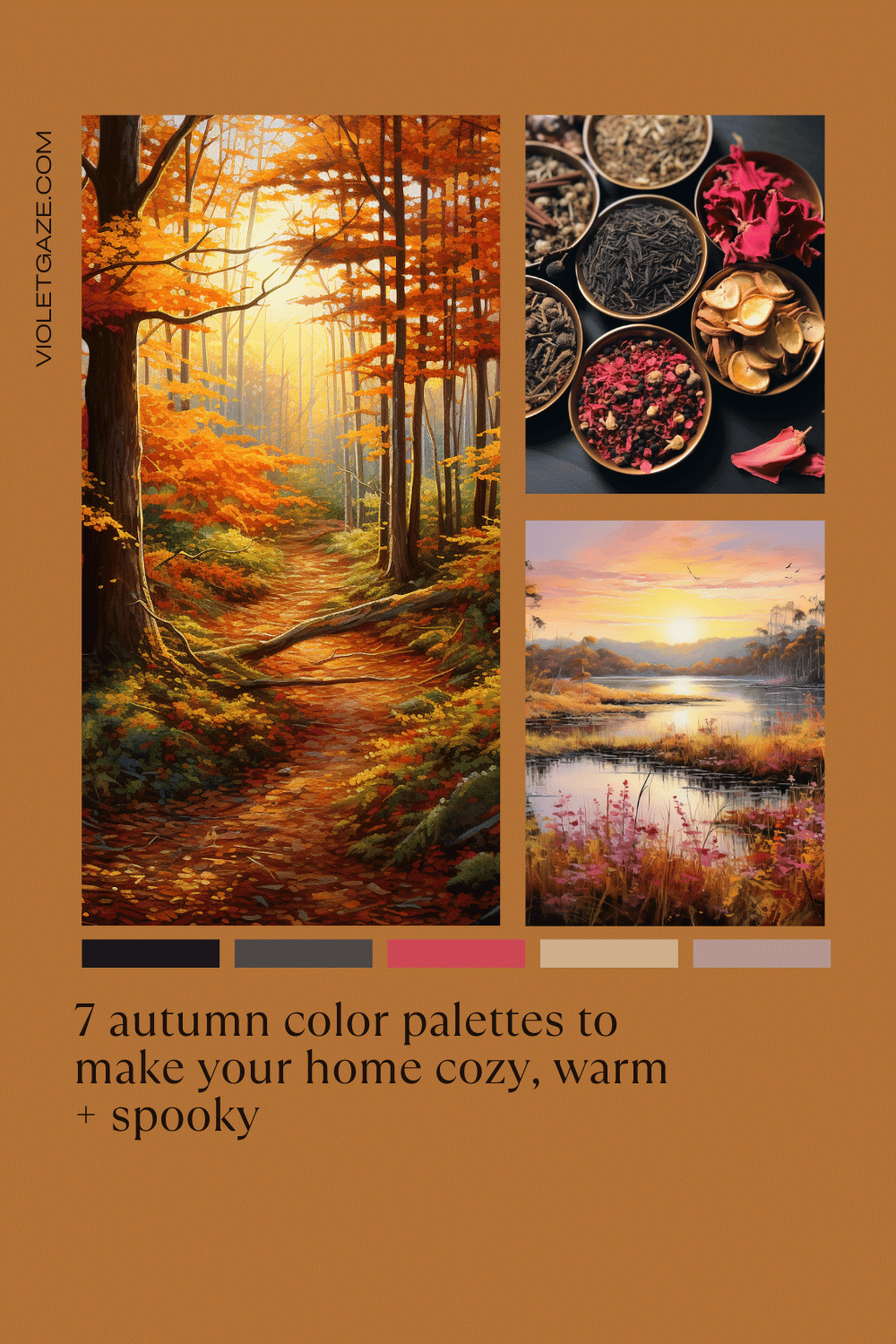
7 autumn color palettes to make your home cozy, warm + spooky
filed under:
October 15, 2023
created on:
As the air turns crisp and leaves begin their descent, there’s one color palette that has always had a special place in a cozy girl’s heart: autumn ones.
If you’re an autumn aficionado and a lover of all things cozy, then picture working on your art, or business, or spending time with your family in a home that reflects the cozy, deep, and ever-changing themes of this gorgeous transitional season.
While, personally, I’m more of a spring girl, it doesn’t mean I wouldn’t love the chance to pull from one of these true autumn palettes that are inspired by this warm and cozy season as much as the next gal.
I always talk about how one of the first parts of transforming your living space is by starting with a color palette. It’s like the skeleton of any design and helps you have a really solid starting ground before you start creating your own shopping list.
So without further ado, enjoy these warm autumn color palettes for your living space.
1. The Classic Fall Palette
This gorgeous palette is full of the most traditional colors in the autumn family: burnt orange, deep reds, golden yellows, and warm browns. Consider it the most classic, true autumn color palette inspired by what you see out your window between September and November months.

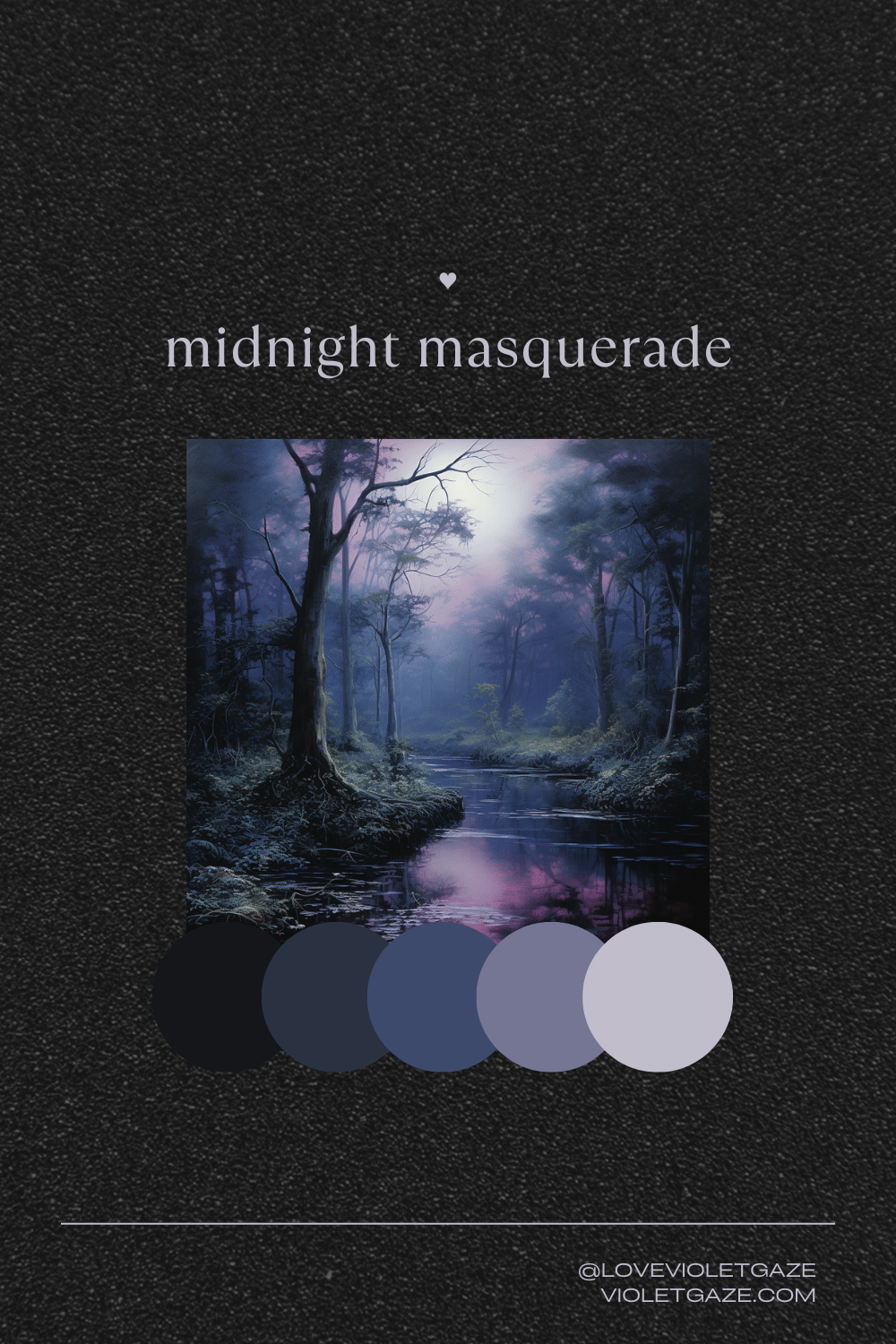
2. Midnight Masquerade
I love this more moody, dark, spooky color palette because it’s not quite the first thing you think of when you imagine fall. It’s definitely more in that spooky, Halloween-y vibe, but I think it’s a gorgeous depiction of the deep purples, midnight blues, and soft grays that you’ll find with some decor around you. I recently visited New Orleans for the first time, and this gives me such NOLA vibes!
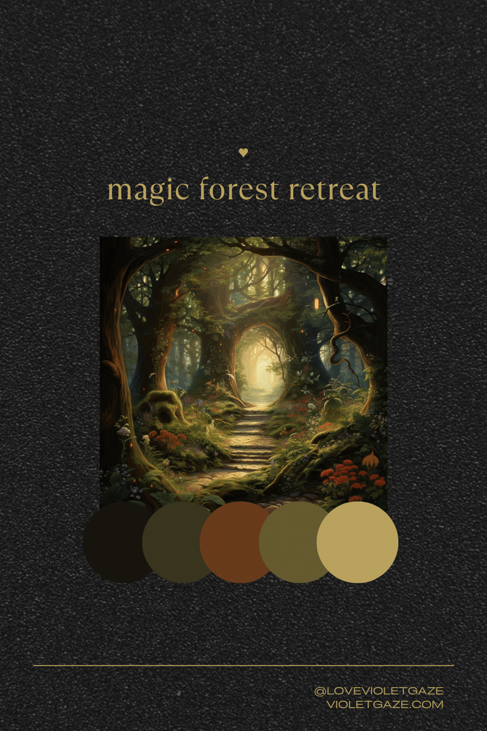
3. Magic Forest Retreat
These moss and olive greens, earthy browns, muted gold, and a touch of auburn and burgundy definitely encapsulate the deeper, earthiness of what fall could be. I think that orange really brings everything together, and I love how in this image in particular, there are some little hints of rainbow dots if you look closely enough. Perhaps these could translate to some pops of jewel tones in this warm autumn palette.
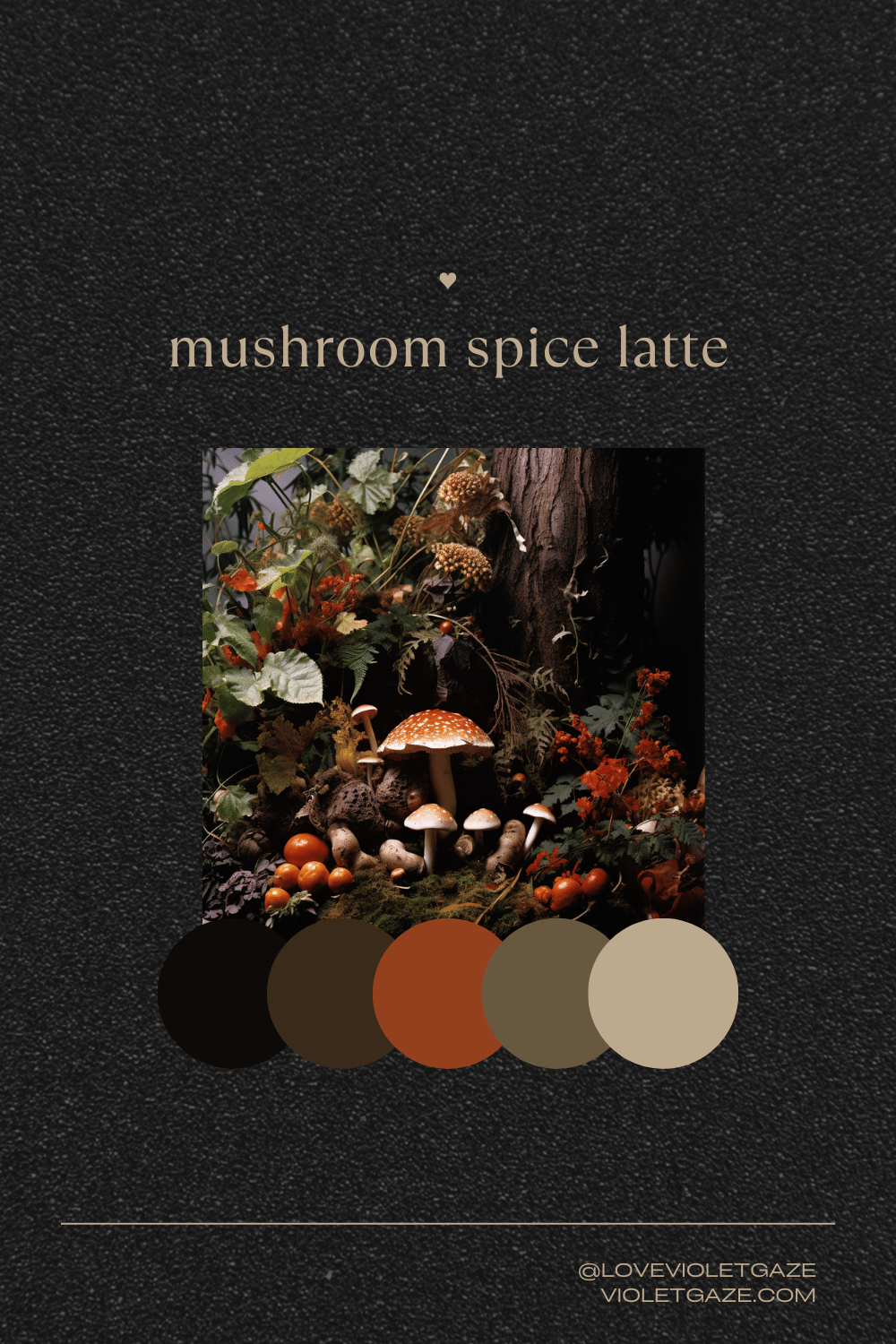
4. Mushroom Spice Latte
Creamy whites, cinnamon brown, pumpkin orange, and a hint of coffee black are all whipped up into this beautiful, whimsical, mushroom-y paradise of a more neutral yet still fun batch of autumn colors.
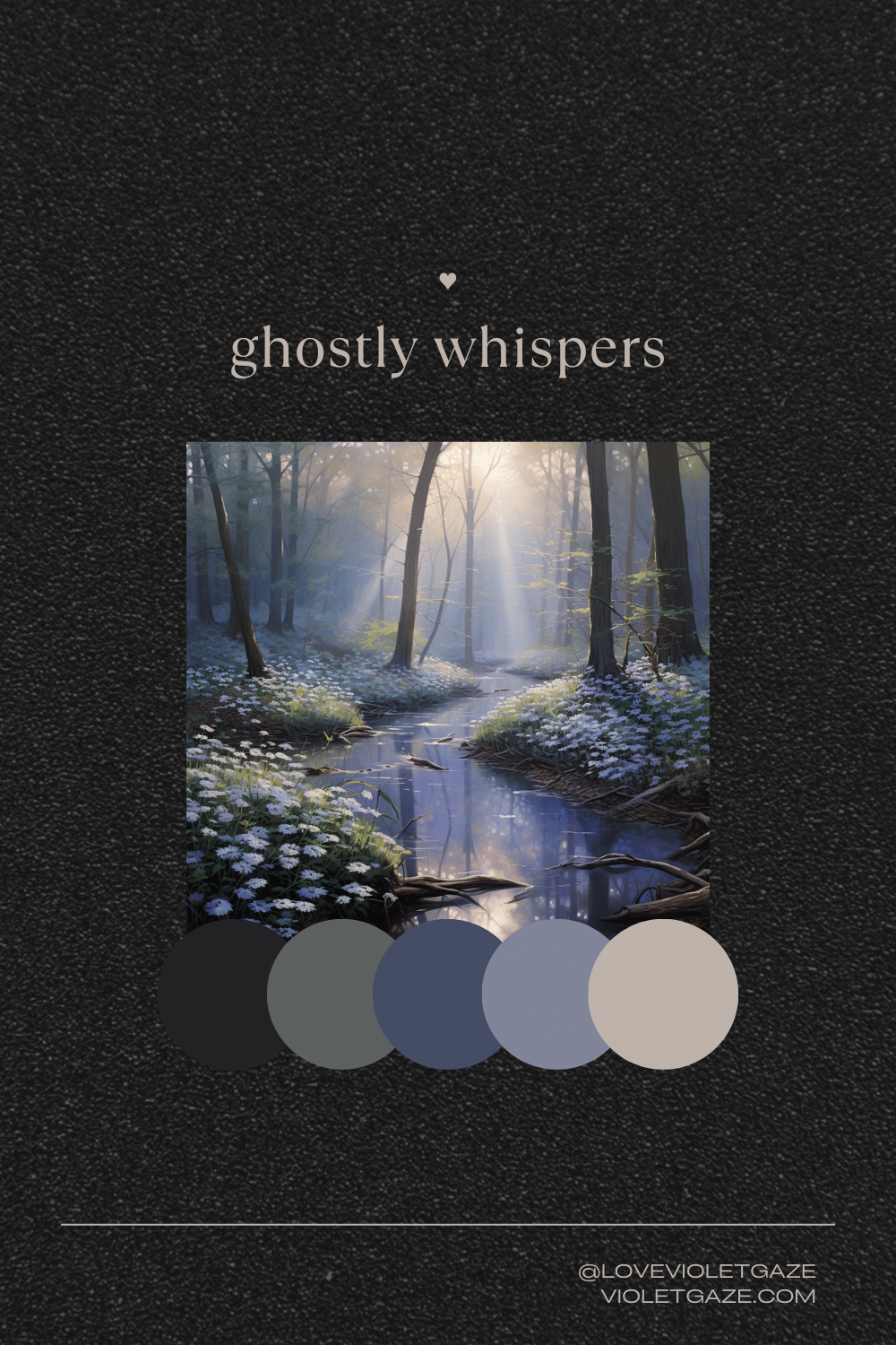
5. Ghostly Whispers
Pale lilacs, soft grays, ghostly whites, and muted blues fill this color palette with something that’s light enough not to be your traditional fall color palette but dark yet muted enough to have a truly spooky nature to it. The gray in particular could add such a ghostly vibe to your space, especially if you’re going for some moody interior design style.
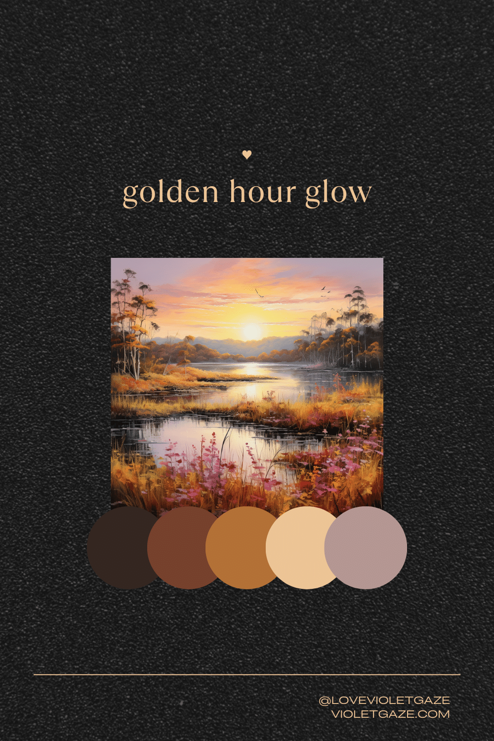
6. Golden Hour Glow
I absolutely love the last color in this palette— the rosy pink— along with the dark golden brown, lavender purple, and twilight blue. I’d consider this one of my favorite ones of the bunch, encapsulating a warm, feminine autumn that anyone could love.
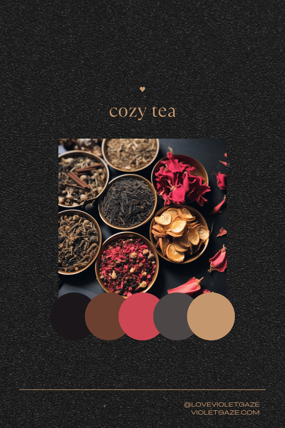
7. Cozy Tea
Pulling from the beautiful array of colors that cozy teas can bring, I especially love the pop of cranberry red in this palette balanced with soft beige, honey amber, and cocoa brown. Personally, I could really see either a black or beige wall with cranberry being the secondary color, popping in and out and reminding me of sweet, autumnal cranberry cookies.
So… where do we go from here?
- Create a Pinterest board for a room you’d like to design that needs some love.
- Pick your favorite color palette from the list above.
- Pick the paint color for the walls as your 60% color; our favorite brands are Sherwin Williams, Benjamin Moore Aura, Sherwin-Williams Harmony Zero VOC Interior Acrylic Latex Paint, Clare, and Backdrop.
- Curate pieces around your home (or inspiration pieces online that could drive your thrifting journey!) into a Spoak or Canva board.
- Play around with the pieces until you have a functional arrangement you love! Take KonMari and Feng Shui elements into perspective when you’re doing this.
- Live in and love your new space.


")


