


")


The paint swatches are scattered across your floor like fallen autumn leaves.
Your partner walked by twenty minutes ago and wisely chose not to comment on your intense comparison of “Chantilly Lace” versus “White Dove.”
Paint colors are the silent architects of your daily moods. That soft sage in your bedroom could be the difference between peaceful mornings and chaotic wake-ups.
Your Pinterest board is overflowing with inspiration, yet here you are, frozen in the paint aisle, questioning if “Swiss Coffee” is too warm or if “Cloud White” is too cool for your space. Let’s dive into how to overcome analysis paralysis and choosing paint colors for home with confidence, so you can feel your most creative and inspired self.
Related: Dreamy Artist Workspace Organization Tips
What is Color Psychology?: Analysis Paralysis and Choosing Paint Colors For Your Home
Many creatives struggle with analysis paralysis and choosing paint colors for home, but it doesn’t have to be overwhelming!
Home color psychology can actually be so much fun when creating a space meant to support your emotional wellbeing and creativity.
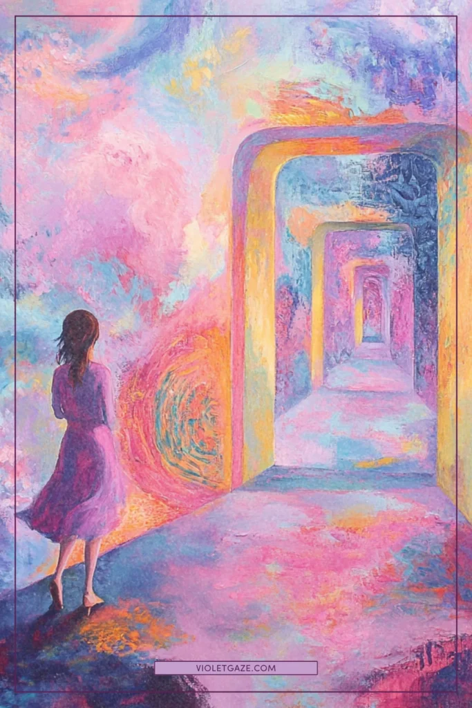
Colors are a silent conversation your space has with your soul every single day. When you understand the language of color psychology, choosing paint becomes less about trends and more about creating the emotional atmosphere you crave in your space.
For instance, sage green has a sense of tranquility and balance, perfect for a bedroom where you want to unwind. Meanwhile, coral energizes and inspires, making it a beautiful choice for a creative studio or home office where you need that spark of motivation.
Blues can lower blood pressure and heart rate, making them perfect for bathrooms or meditation spaces. Yellows increase serotonin, which is why they’re so lovely in kitchens where families gather.
And on and on and on. 
Understanding these subtle effects helps you choose colors that not only look beautiful but feel right for how you want to live and create in your space. Understanding these psychological effects can help minimize analysis paralysis and choosing paint colors for home — especially with the right mindset.
The Mindset of DIYing Your Home
It’s Just Paint
The key to overcoming analysis paralysis and choosing paint colors for home is to find the patterns in what you love. Whenever you’re on Pinterest looking for inspiration, see the relationship between all the photos you’re pinning. Is it warm colors? Cool colors? Pops? Neutrals?
I also want to emphasize the emotional weight we put on every single decision as creatives. There are some things that are totally unchangeable, like a song we release or a film we’ve created.
But paint? It’s just paint.
While analysis paralysis and choosing paint colors for home is common, remember that paint is one of the most changeable elements in design. Paint is one of the most forgiving design elements in your home. It’s not like choosing the wrong structural beam or making an irreversible architectural decision.
Our choice to push these decisions off is just pushing off a (small!) investment in your daily joy and literal quality of life.
A gallon of paint typically costs between $30-60, and yes, while a whole room repaint might take a weekend of your time, it’s not the end of the world if your first choice isn’t perfect. Think of it like dating — sometimes you need to try a few colors before you find “the one.”
Everyone should live in a home that feels like a retreat — and that means making time and space to honor and care for your home just like you’d care for a baby, a pet, or another human being. That means investing a little bit of money, time and energy in something that will bring joy to you every time you see it.
Perfect Doesn’t Exist, But “Perfect for You” Does
The most beautiful homes aren’t the ones that look like they jumped straight out of a magazine, but the ones that tell the story of the people who live there.
That deep aubergine accent wall might raise some eyebrows, but if it makes your heart sing every time you see it, that’s perfection. Modern home color trends can provide inspiration — for sure! — don’t feel pressured to follow them if they don’t resonate with you.
I was watching Vanessa Hudgens’ Architectural Digest Open Door tour where her black kitchen perfectly captured her moody aesthetic.
I have a dark purple bedroom that I’m sure not everyone would fancy but it aligns perfectly with my desire for a cozy, cocoon-like atmosphere.
It’s perfect for you if you feel the flutter in your heart when you see something like it on Pinterest — it’s really that simple.
Related: The Overthinker’s Guide to Making Imperfect Art
Think of It as an Evolution
Your home, like you, is on a journey of becoming.
The colors that speak to you today might shift as you grow and change — and that’s beautiful! Maybe that bright yellow living room that energized you during a particularly grey season of life will eventually transform into a soft cream that better suits your current need for calm.
Evolution in your home is a sign that you’re living authentically in your space. Your home should reflect where you are now while leaving room for who you’re becoming.

How to Find Your Next Wall Color
Let me share some tried-and-true interior paint selection tips that have helped countless homeowners find their perfect palette.
Remember that this is about choosing a color that resonates with your current season of life and the energy you want to cultivate in your space right now. Paint is paint is paint.
Create a Mood Board
Digital tools like Spoak and Canva have revolutionized how we can visualize colors before committing, so before making any decisions, create a board for each room you’re planning to paint.
You can find room color inspiration in unexpected places — from nature, your favorite artwork, or even your wardrobe. Include images of textiles, artwork, and even photos that capture the feeling you want in the space. Your mood board doesn’t (and shouldn’t) just be pictures of interiors, but everything that makes you feel that flutter.
Pay attention to which colors keep drawing your eye. What shades appear repeatedly in the images you’re naturally attracted to?
Subconsciously, these patterns are telling you what resonates with your authentic self.
Get Your Sample and Test it in Multiple Corners
This is sometimes where surprises pop up! Paint colors are shape-shifters, and can transform dramatically throughout the day as the natural light in your home changes.
During your paint swatches comparison, make sure to view them both in the natural and artificial light that’s going to live in that space.
Paint large swatches — at least 2 feet by 2 feet — on multiple walls in your room. Take a look at them during different times of day and in different weather conditions. Pay special attention to how the color looks during the hours you’ll use the room most and see if that sparks joy for you or if you want to look into something different.
Related: 7 Quotes About Interior Design to Inspire Your Home Studio

Still Stuck?: Lighter for Small Rooms, Darker for Large Rooms
While this isn’t a hard-and-fast rule (because rules were made to be thoughtfully broken), it’s a helpful starting point if you’re feeling overwhelmed.
Firstly, exploring neutral paint combinations can provide a versatile foundation for any room’s design. So if you’re feeling overwhelmed (and already have a lot of brighter furniture), opt for neutral so you can have fun with your decor.
Also, in general, lighter colors tend to make walls recede, creating an airy, expansive feeling in smaller spaces. Darker colors bring walls forward, adding cozy intimacy to larger rooms that might otherwise feel too vast.

So if you want a simple rule (and one that I usually follow), I like to stick to lighter colors for smaller rooms without much natural sunlight, and darker colors for larger rooms with lots of natural sunlight.
Here’s the nuance: a small room in a dark, rich color can feel like a gorgeous jewel box, while a large room in light colors can feel ethereal and cloud-like.
So really, it’s less about following rules and more about understanding how color affects space.
Let’s Make Your Space Feel Like the Creative You
Everyone’s home should be the backdrop to your life’s story. The colors you choose are like the soundtrack to your daily adventures, setting the tone for everything from morning coffee rituals to late-night writing sessions.
Move past analysis paralysis and choosing paint colors for home to create spaces you truly love — because your home should be your creative sanctuary, not a source of stress.Join our community of home lovers and artists who are creating their perfect spaces. Subscribe on YouTube to create spaces in your creative journey that not only look beautiful but feel authentically, magically you. 


